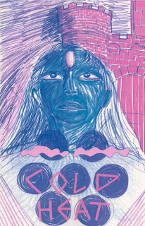
Cold Heat #5/6
Ben Jones & Frank Santoro  As of this review, there are still copies of this double issue of Cold Heat available through Picture Box's website. It is expensive for a comic book: $20. But you know what? It's limited to only 100 copies. You know something else? It's pretty much worth it. I'd rather pay $20 for a comic of this quality than $4 for a lousy superhero crossover book anytime. But if it's a good superhero crossover book, I may have to think twice about that. But anyway, I'll tell you right now, this is going to be one of the best books of the year. It's that damn good.
.
 As of this review, there are still copies of this double issue of Cold Heat available through Picture Box's website. It is expensive for a comic book: $20. But you know what? It's limited to only 100 copies. You know something else? It's pretty much worth it. I'd rather pay $20 for a comic of this quality than $4 for a lousy superhero crossover book anytime. But if it's a good superhero crossover book, I may have to think twice about that. But anyway, I'll tell you right now, this is going to be one of the best books of the year. It's that damn good.
.
That being said, this book is kind of strange. You have to know that going in based on the cover alone. The entire book is told in blue and pink color of varying degrees of expressive art. Pen, crayon, watercolor - whatever the hell these guys decide to use on this book, it turns out really cool as our protagonist Castle kicks ghost-possessed or alien-possessed (or whatever) butt and ultimately achieves perfect clarity to send her idol back into the past (to most likely meet his death, sadly). But anyways, she confronts a Satanic cult and meets a real alien along the way. You would kind of expect this book to be more nonlinear than it actually is. Storywise, it's pretty straight-forward. The art can kind of throw you off, and some weird stuff goes down, but if you pay attention, it's pretty easy to follow. Though some of the weirdness contained in this issue: the Satanic cult leader literally craps on his captive (and later engages in anal sex), and the opening scene of issue five sees a battle between Castle and a possessed minion, the latter of whom falls onto a communicator rod thing and the device goes right through him where his own...phallic device would be. A little out-there, but it's a lot of fun in a twisted way.
.
Through all of this action, the art is pretty much spectacular. Santoro is a great cartoonist beneath all of that crazy color, but the color itself is used in brilliant fashion, especially in scenes like the end of issue six, where Castle is confronting the alien and using her new-found mental powers - it's kind of brilliantly displayed through these creative uses of lines and designs. There's a particular page that stands out for me when the alien is shooting some ray out of his hand at Castle and the Satanic cult leader. All but the alien are outside of this crazy diamond design, but an energy ray is going through Castle and the cult leader, the top halves of their bodies blue, the bottoms pink, meanwhile if you look through the entire scene, there's just a beautiful swirly design there - it's just layered and detailed wonderfully. There are a lot of instances like this throughout the book on top of the craziness that is the creators' storytelling. If there's another book out there more bold and creative than this one (that's actually, you know, good), I'd like to see it. But for now, Castle rocks my world.
Comments